Pho Saigon


Project Overview
Modernizing an established Houston Vietnamese restaurant through interior design, branding and improved customer experience.
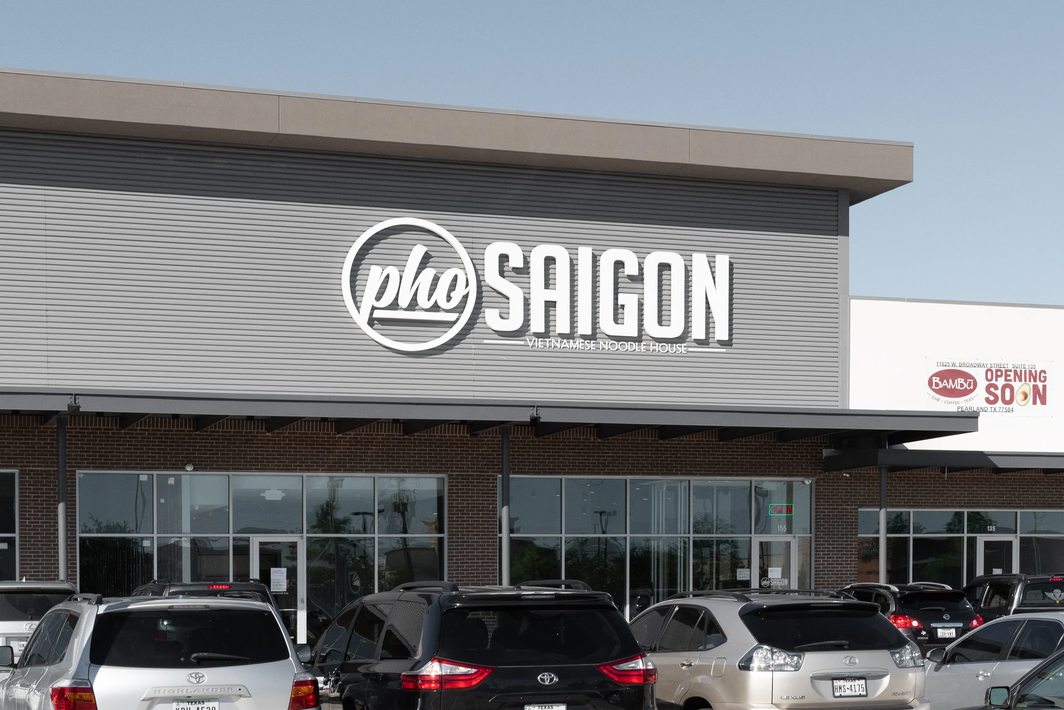
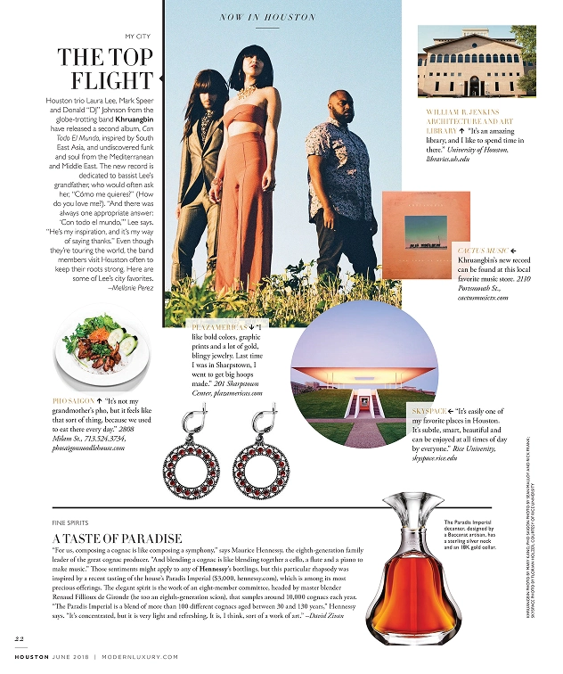
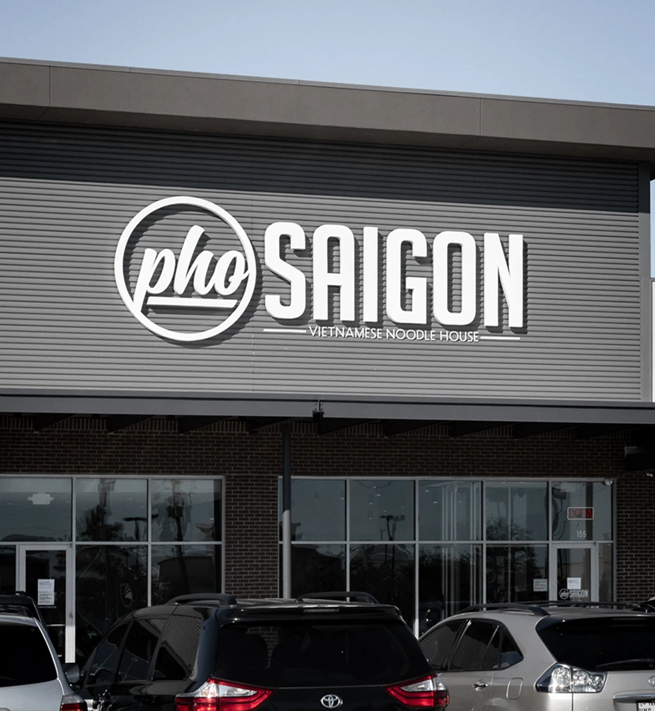
In 2016, Pho Saigon partnered with Cegrix to modernize their flagship Midtown Houston location. Established in 1998, the popular Vietnamese restaurant needed an interior update to reflect its reputation. Cegrix completed the restaurant renovation in overnight shifts without interrupting daily business operations. In 2018, the partnership expanded to include a complete brand identity redesign, menu design, food photography, staff apparel, and storefront signage across multiple locations, including a 15 foot sign at Pearland Town Center.
Services: Facility Design, Brand Identity, Signage, Menu Design, Product Photography | Partnership: Client since 2016
Problem and Solution
Since 1998, Pho Saigon had built a loyal following, earned Best Pho recognition in 2014 and expanded to six locations. However, its flagship restaurant and brand identity had not kept pace.
Outdated Restaurant Interior
The flagship dining room featured a dated cafeteria style ceiling and fluorescent lighting.
Confusing Menu Design
Limited English descriptions on the paper menu made ordering difficult for first time guests.
Worn Walls and Restrooms
Walls and restrooms showed visible wear from daily use, detracting from the dining experience.
Inconsistent Brand Identity
The original logo lacked consistency and a unified visual identity across six restaurant locations.
One identity, the mark, the menu, the shirt, the sign, built so every new location could open with it. The flagship was rebuilt first.
What follows is what Cegrix built, and what it looks like today.
Logo and Brand Identity Design
Pho Saigon had a logo that was barely used and rarely shown the same way twice.
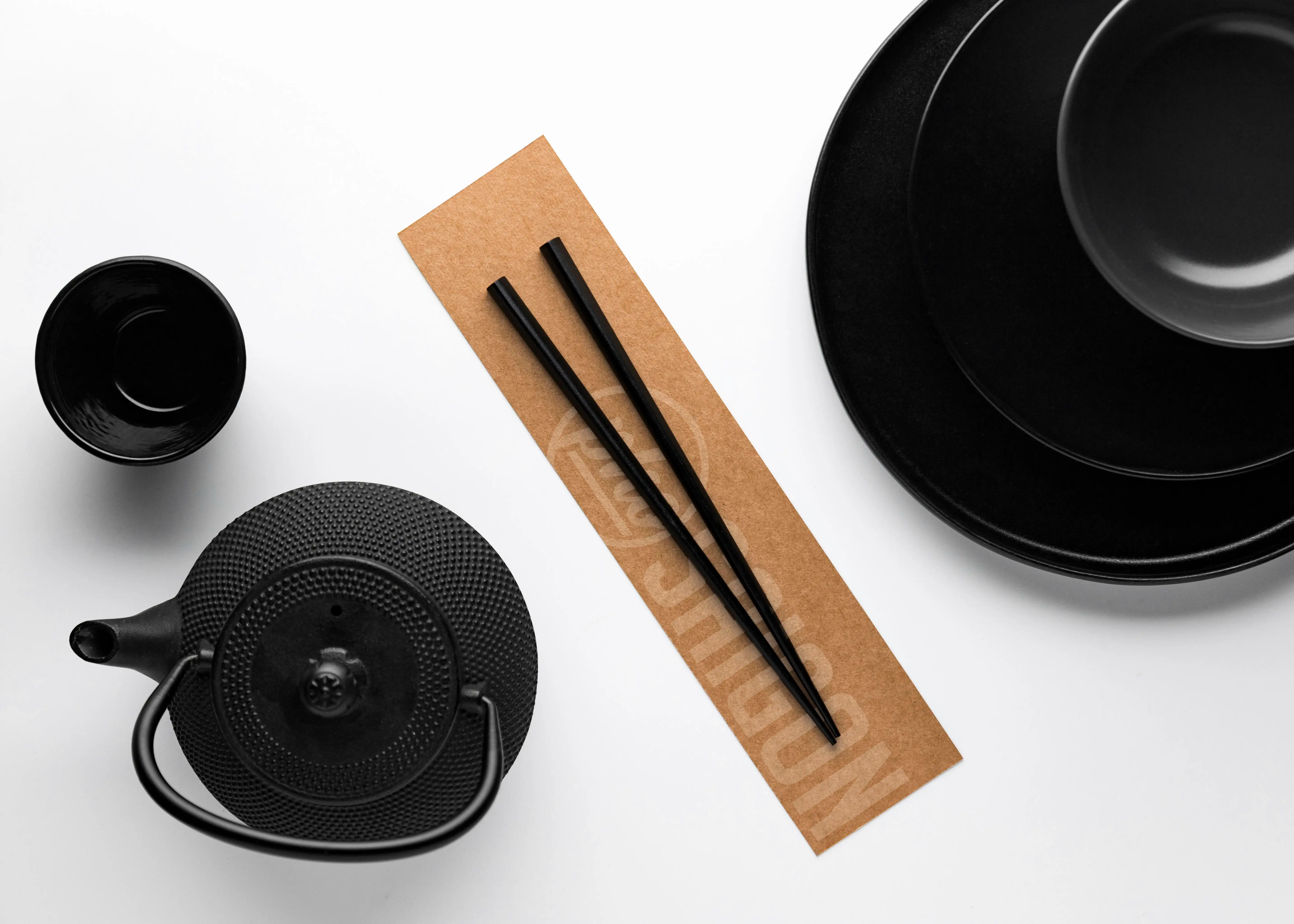
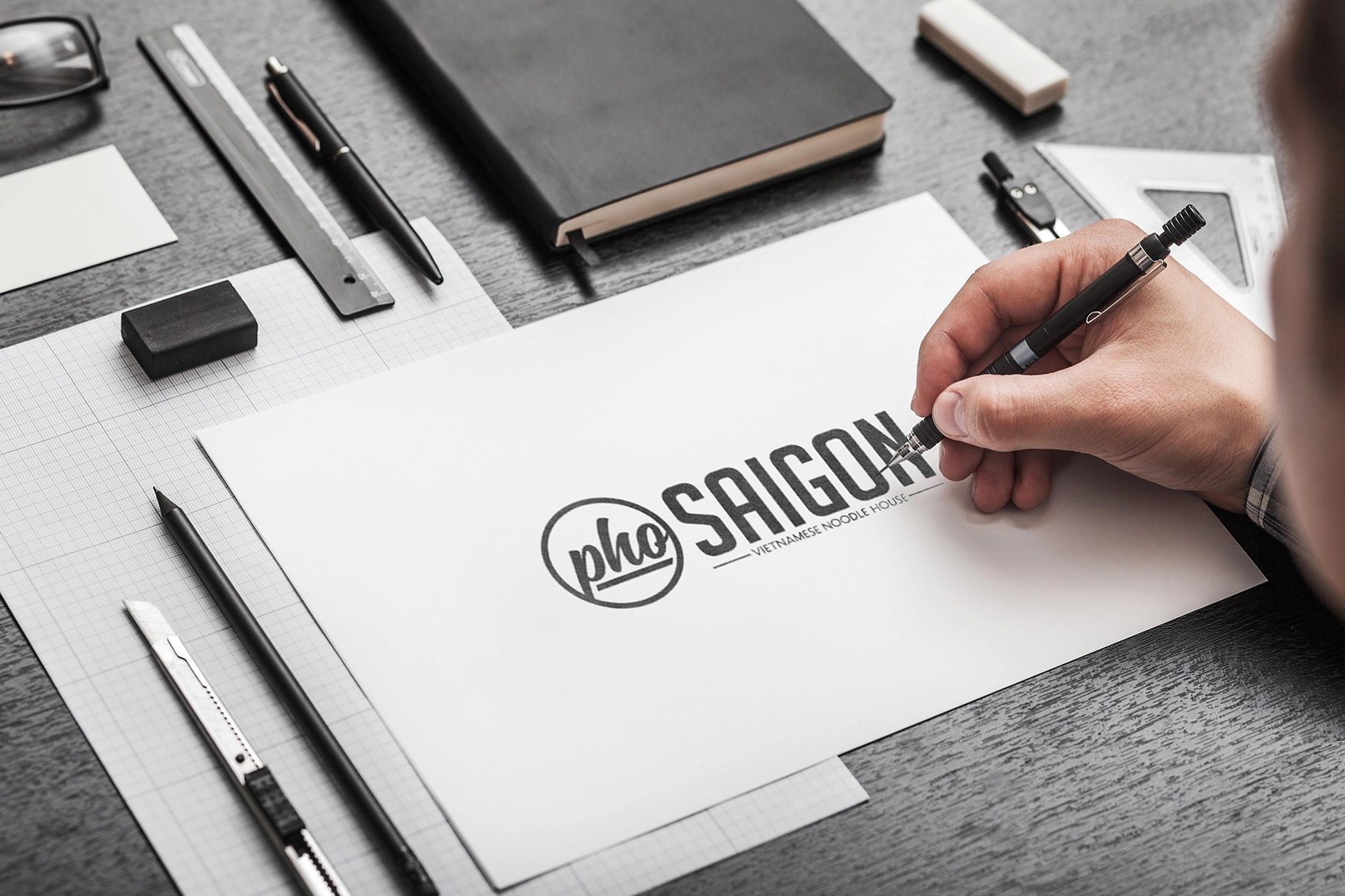
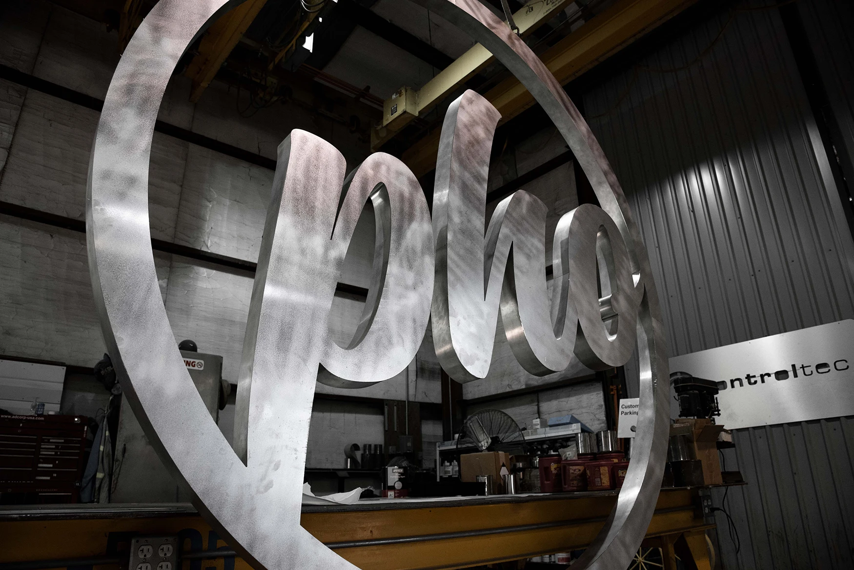
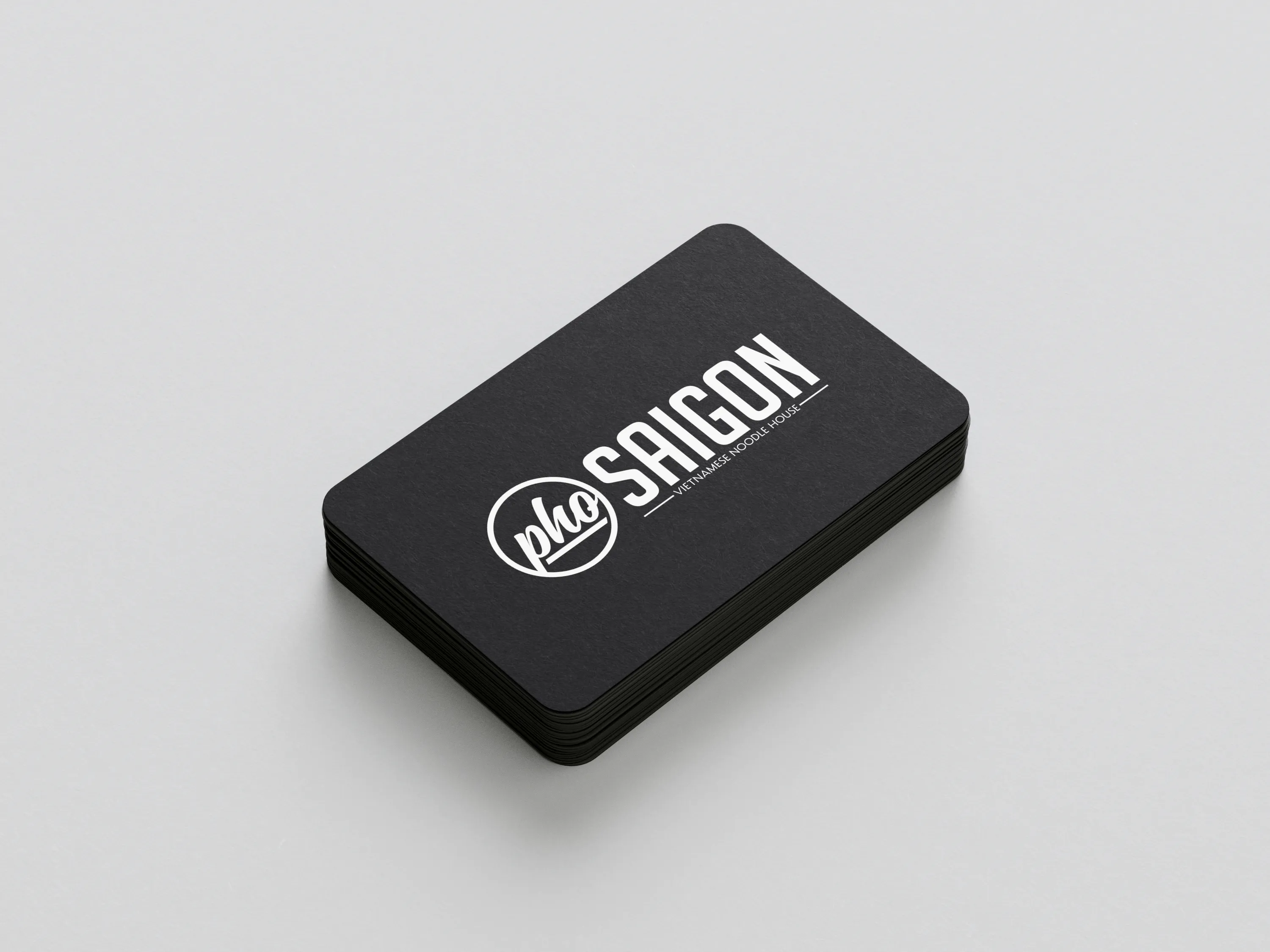
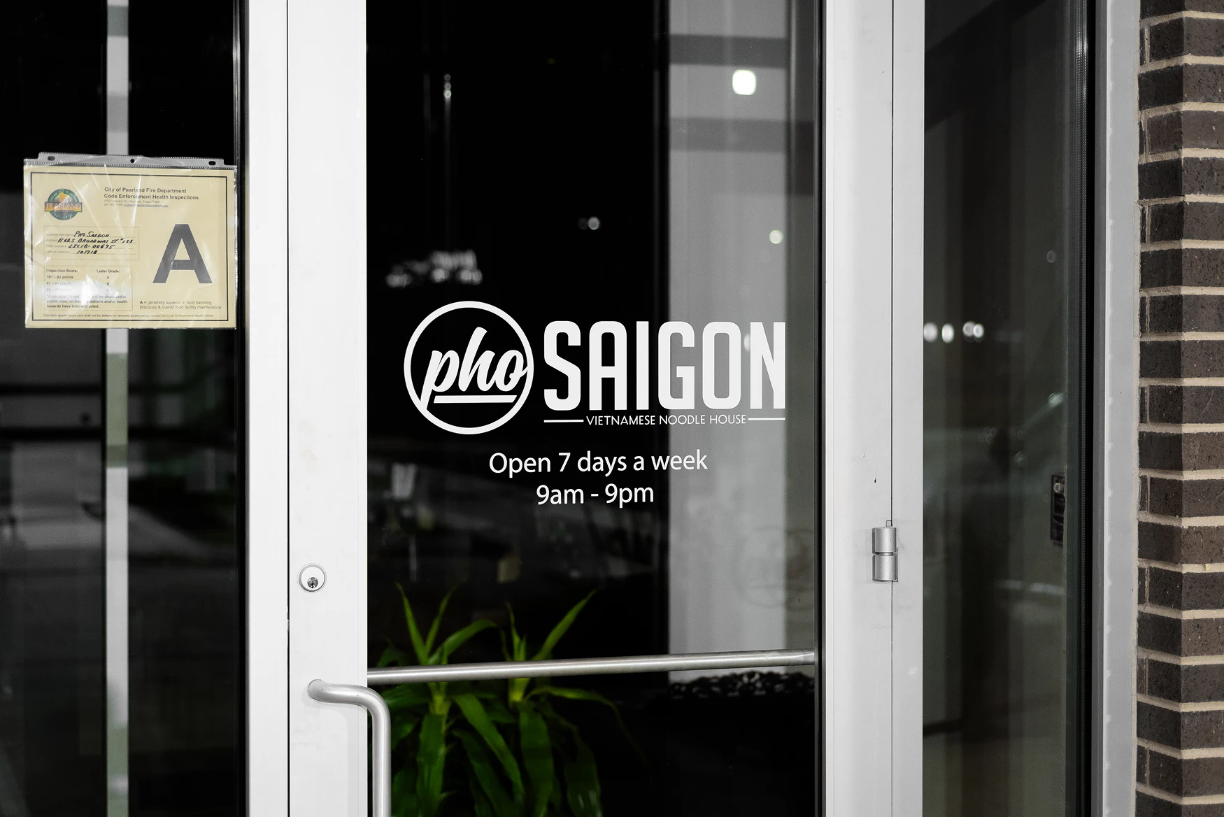
In 2018 Cegrix designed a new mark from a blank page. Nothing of the old one survived. It was built into an identity that went onto the storefronts, the menus, the shirts and thephosaigon.com, and registered as a trademark in 2026.


Restaurant Remodel and Interior Design
Cafeteria ceiling, fluorescent light, walls that showed every service.
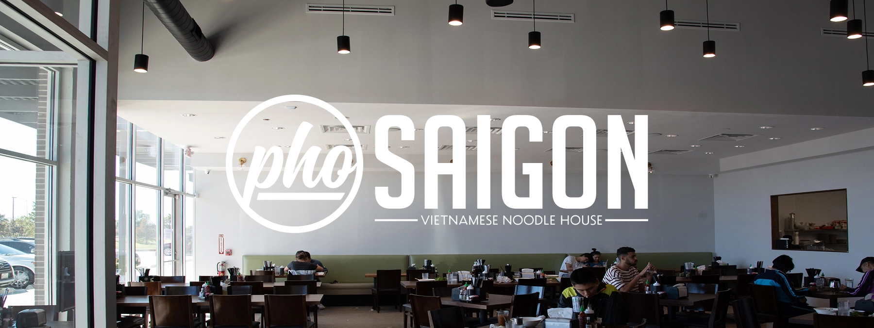
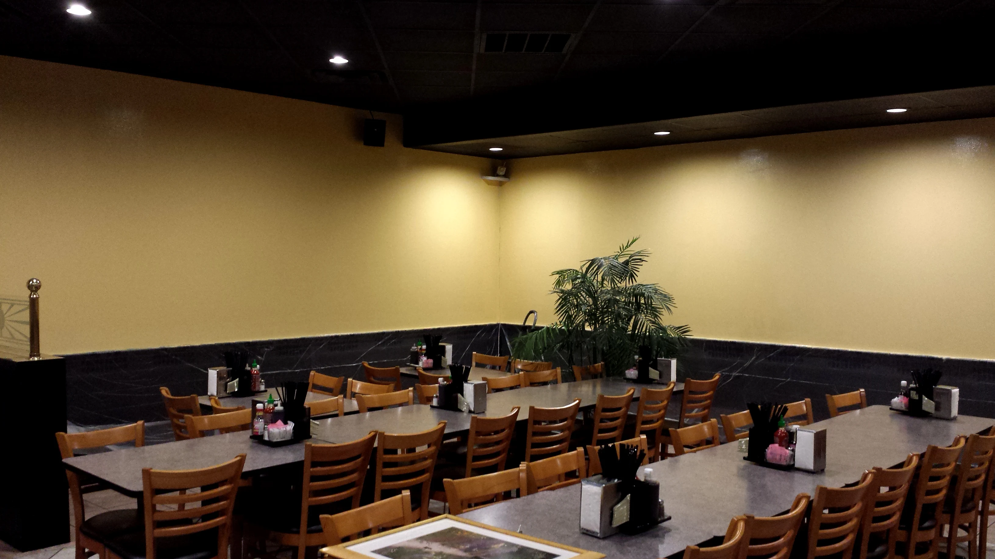
Pho Saigon called Cegrix in for artwork and design. Then it asked what Cegrix would do with the room. Cegrix answered with mockups, then ran the build between close and open, over about a week and a half in 2016. The restaurant served every day, with sections roped off before morning where work was still finishing. The brief was customer experience in the plainest sense: a room that works at the peak of a lunch rush, for the guest eating in it and the staff turning it. The old ceiling came out and a black drop ceiling with LED can lighting went in, and the room went from cafeteria to dining room. Satin black wainscot went on the lower walls, and the original yellow stayed above it for contrast and for the regulars who knew the room. Restrooms were updated in the same pass and built to be easier to keep clean.
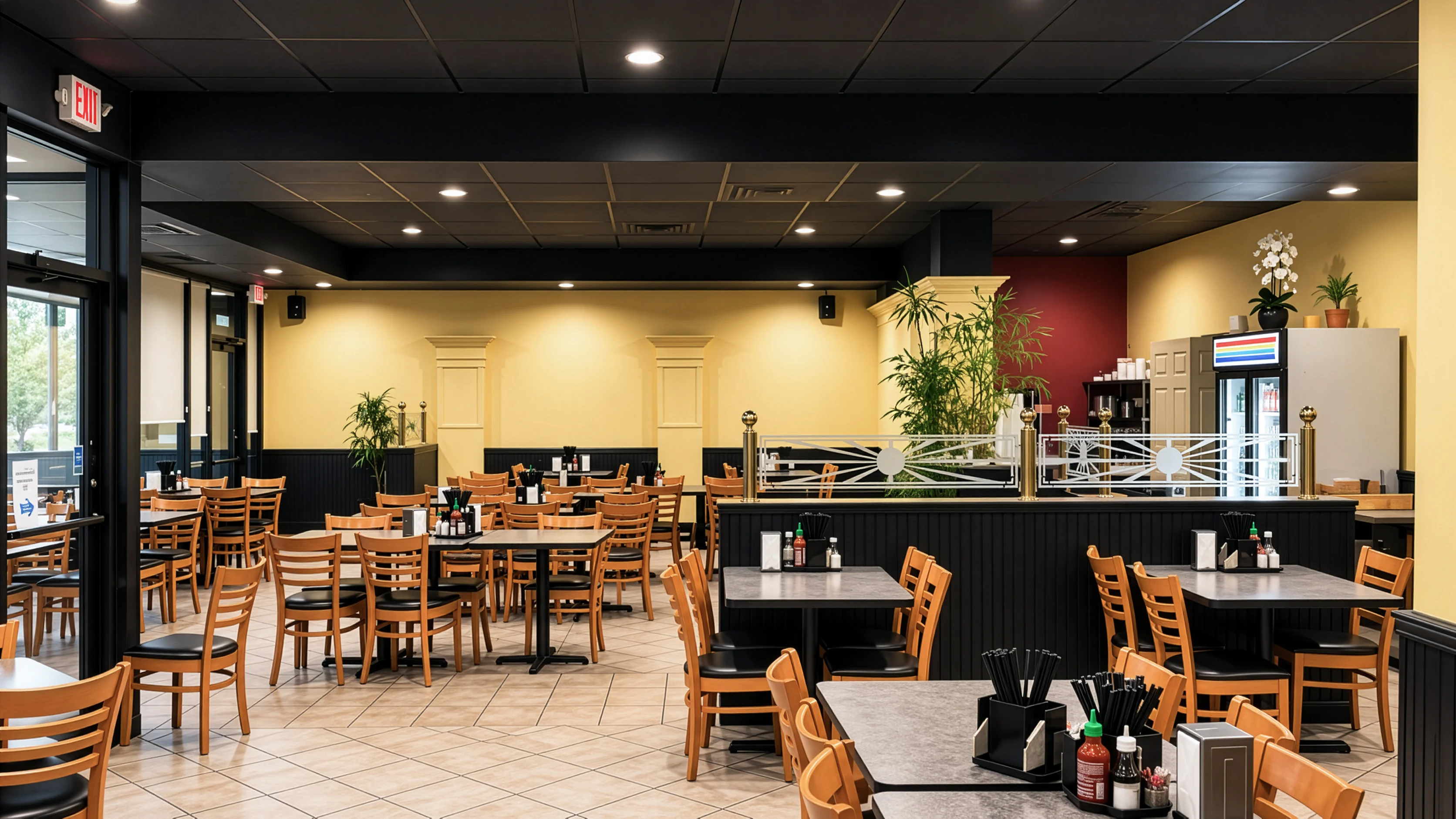
Why the wainscot is black
Pho splashes. Satin black oil based paint wipes clean and hides what a day of service leaves on a wall, so the room looks the same at close as it did at open. The guest can eat without worrying about the wall. The staff get a wall they can keep that way. One decision, two audiences.
Culinary Photography
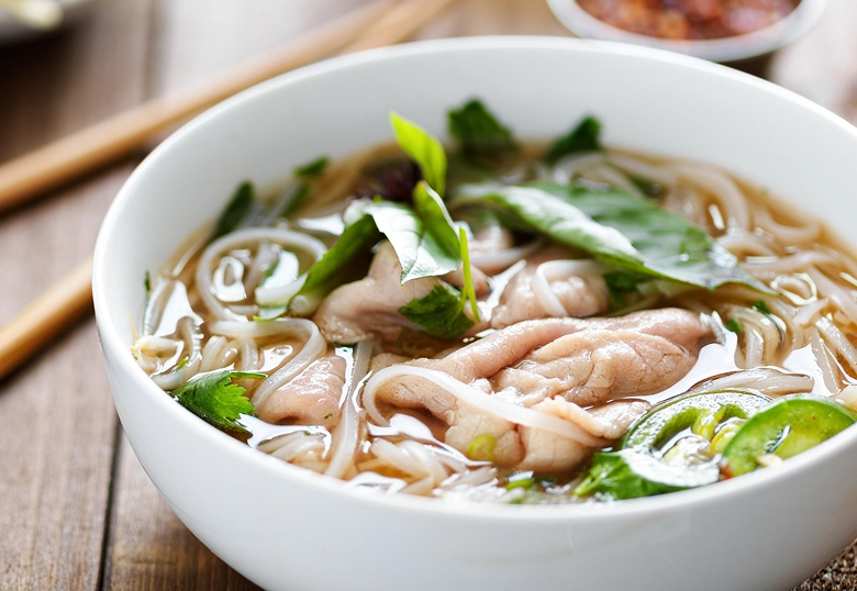
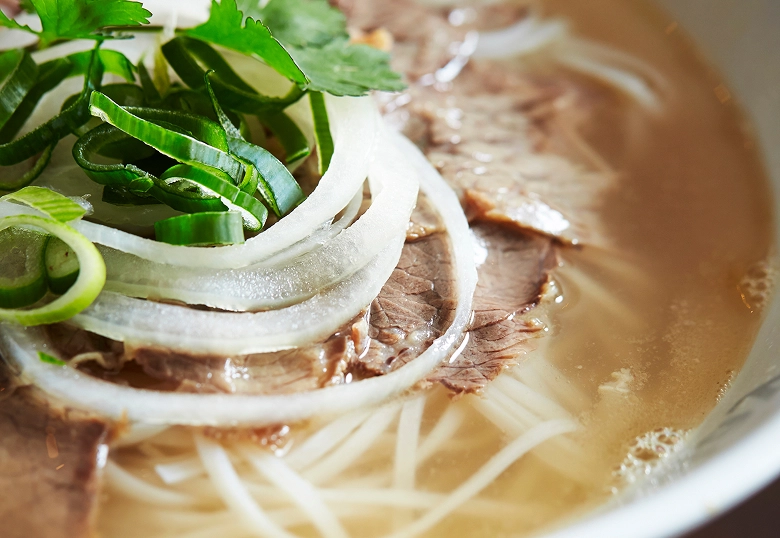
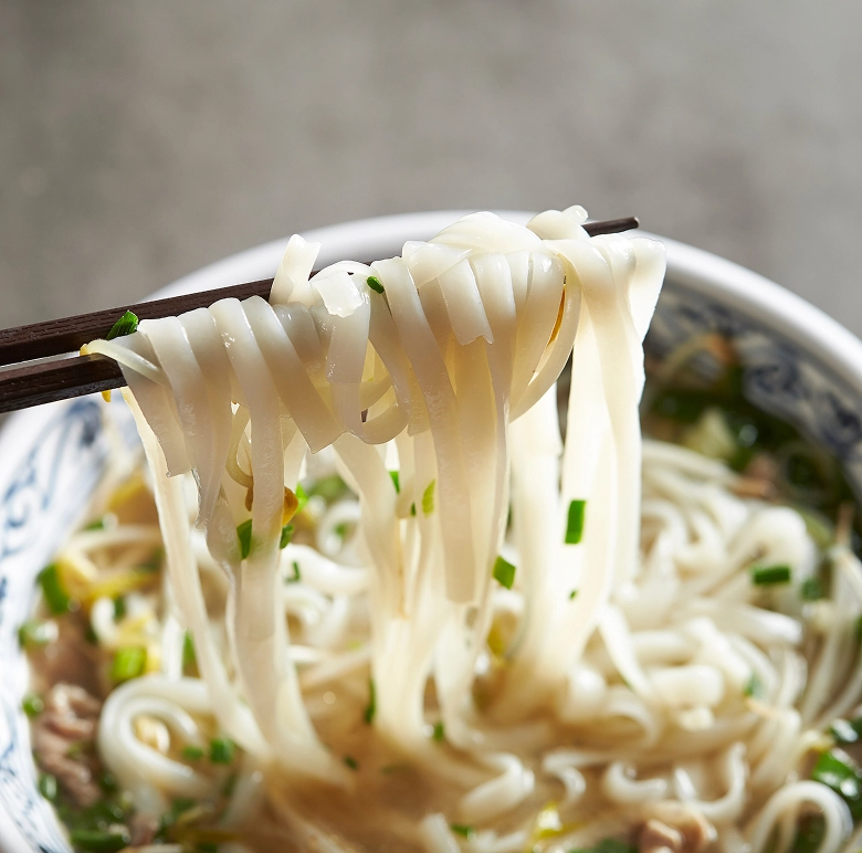
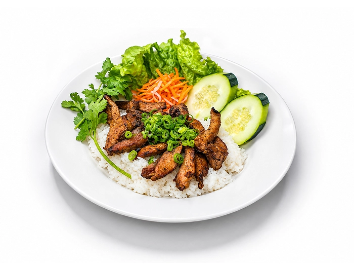
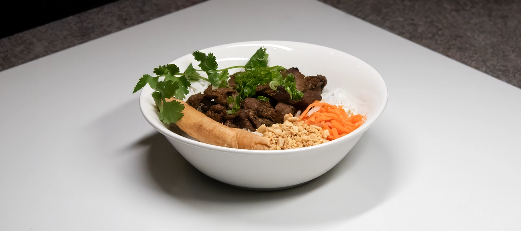
Before the menus could be rebuilt around images, the food had to be photographed to a standard worth printing. Cegrix shot the Pho Saigon menu dish by dish, styled for the plate a guest actually receives.
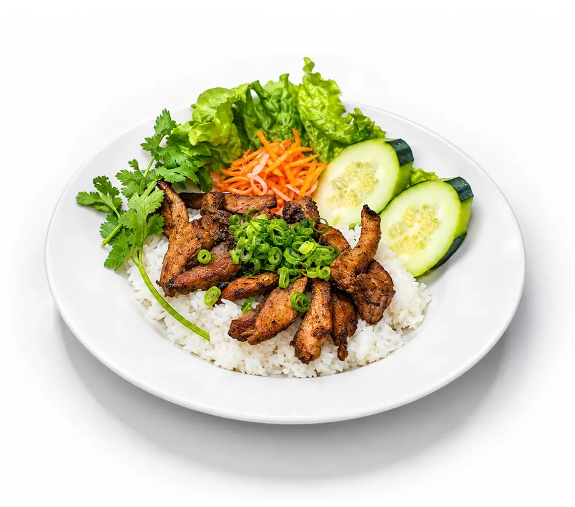
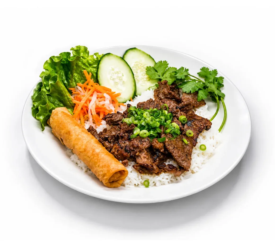
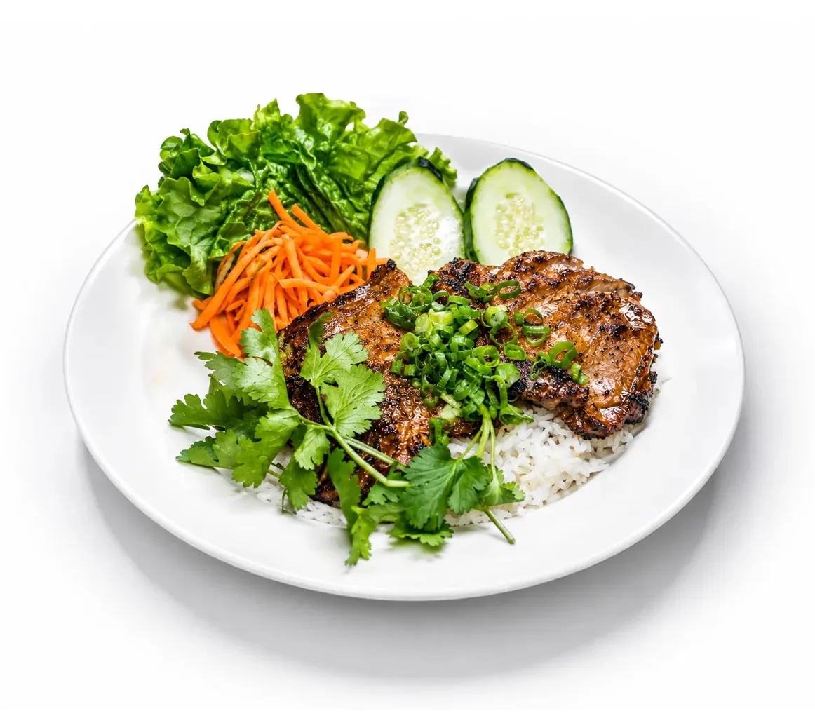
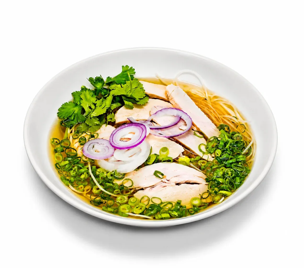
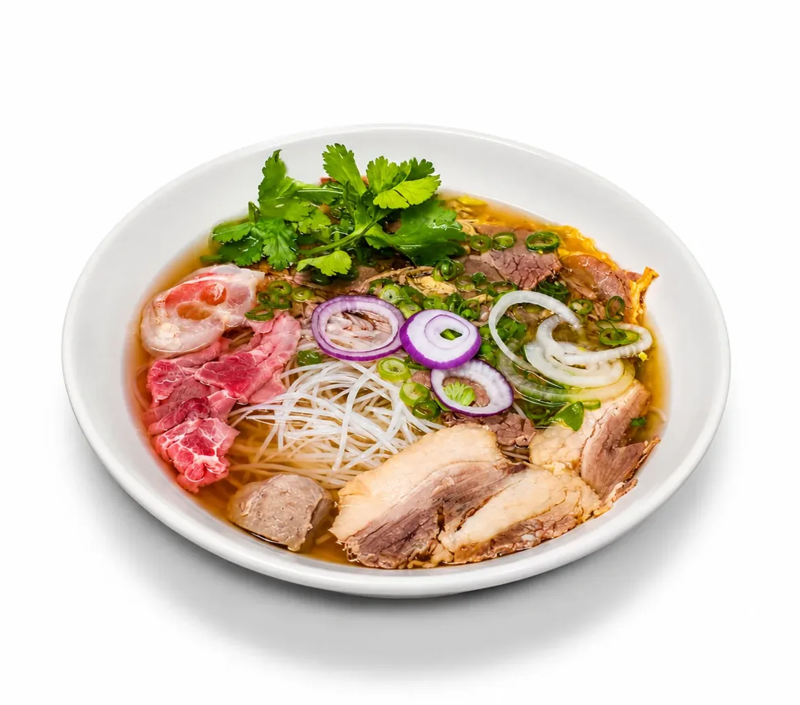
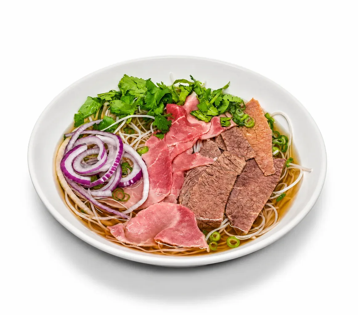
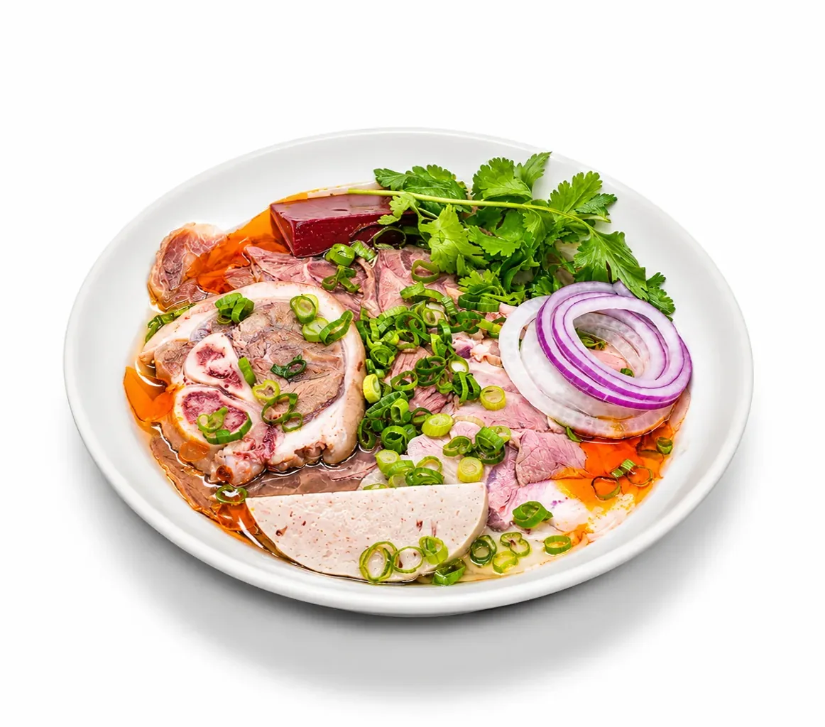
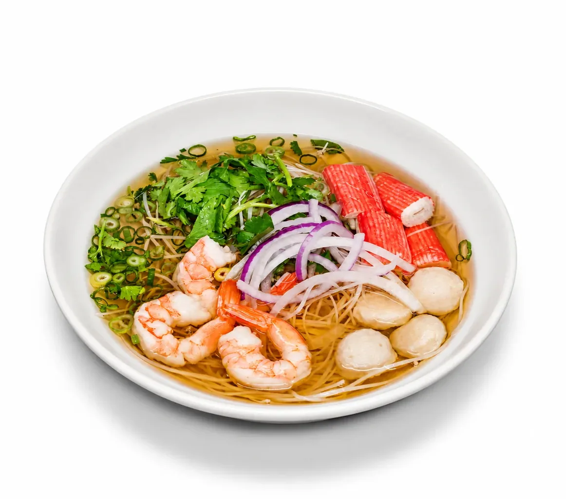
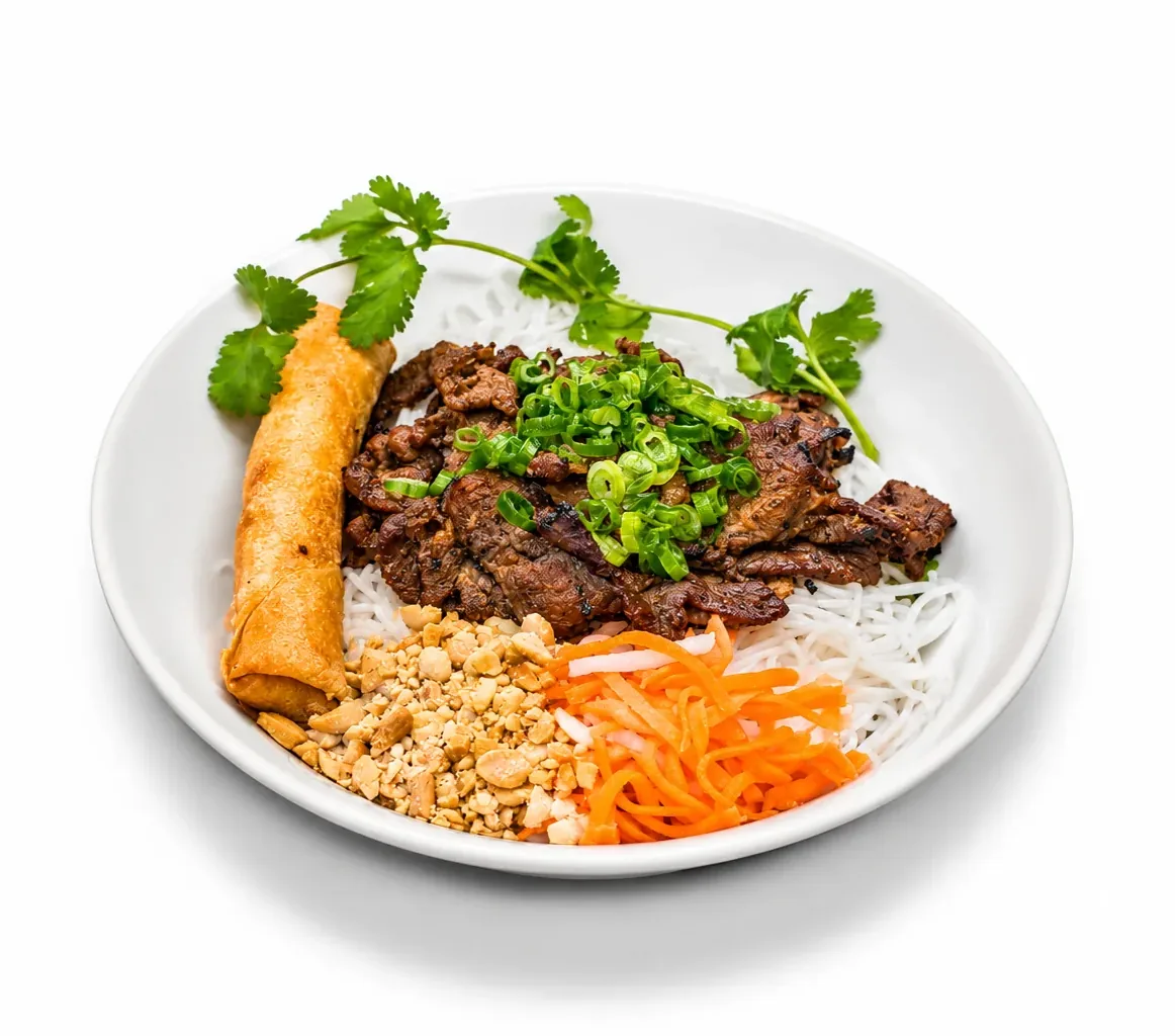
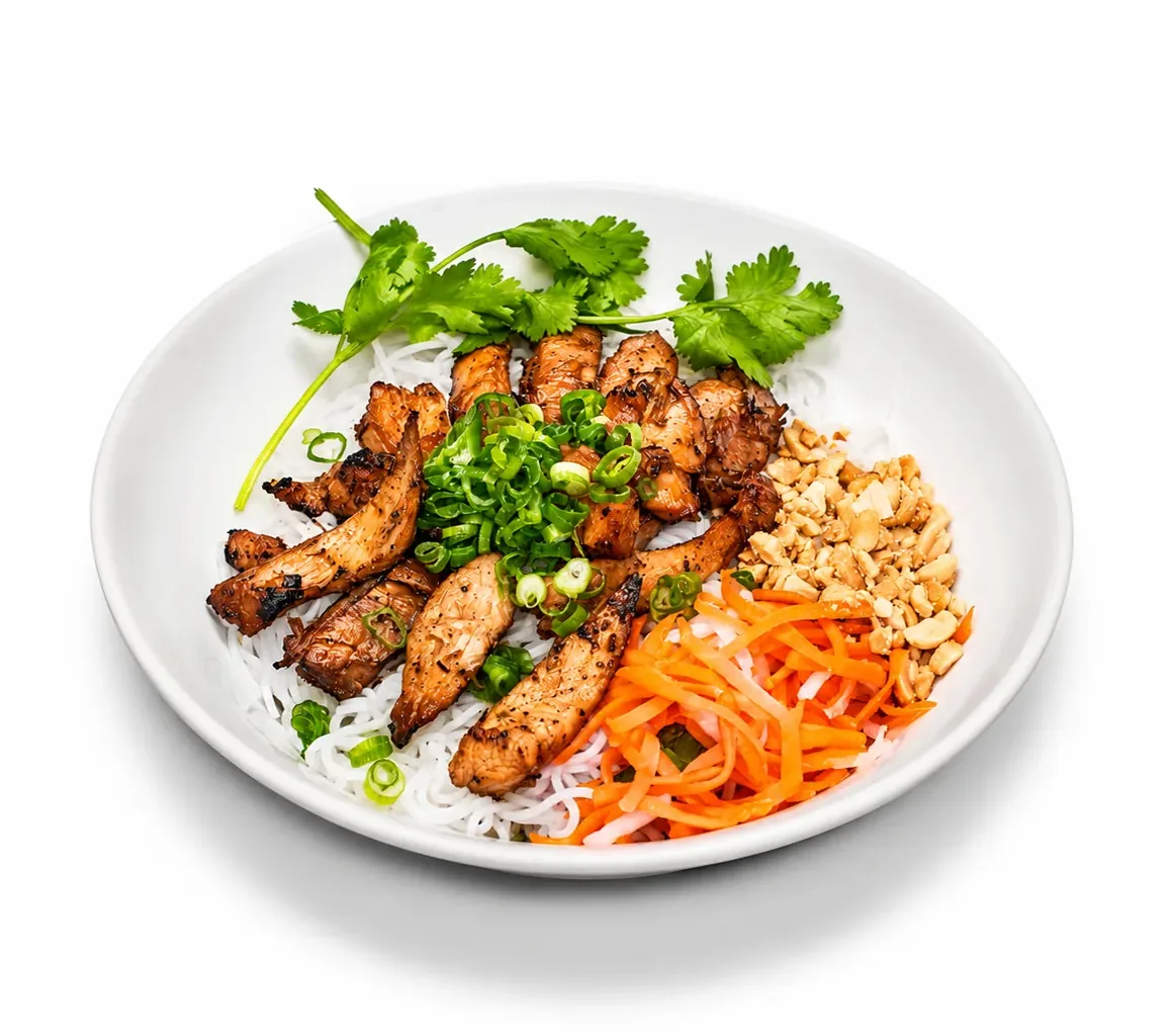
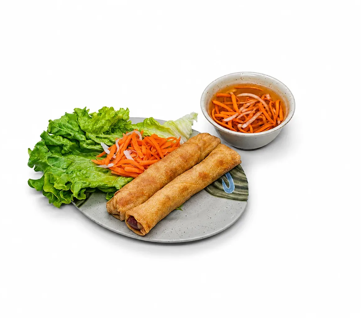
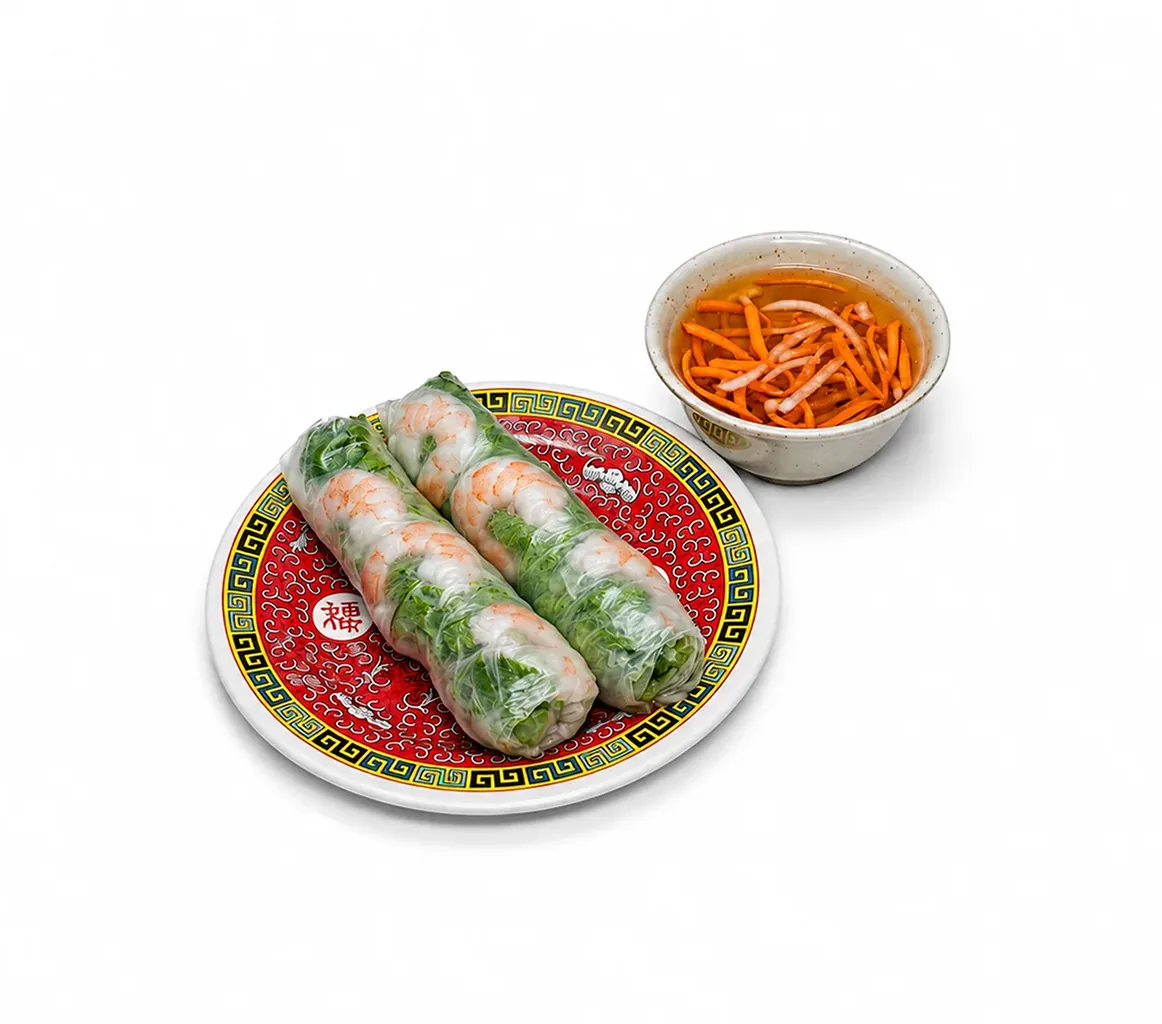
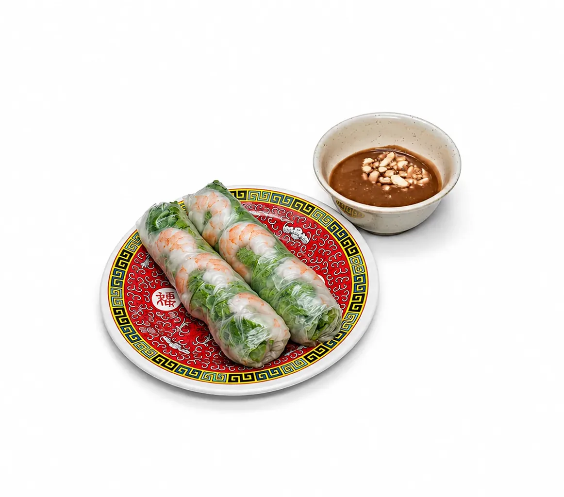
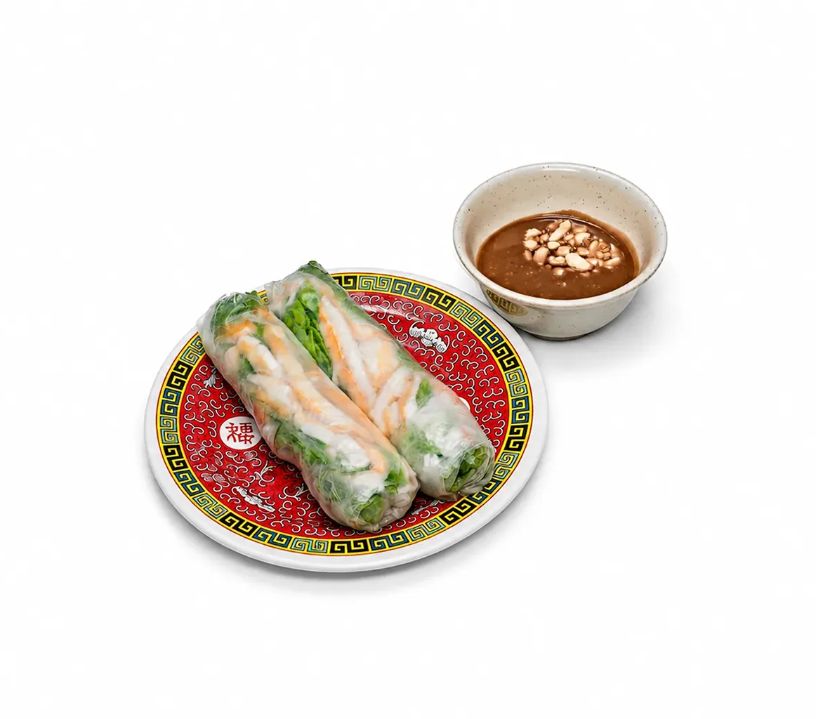
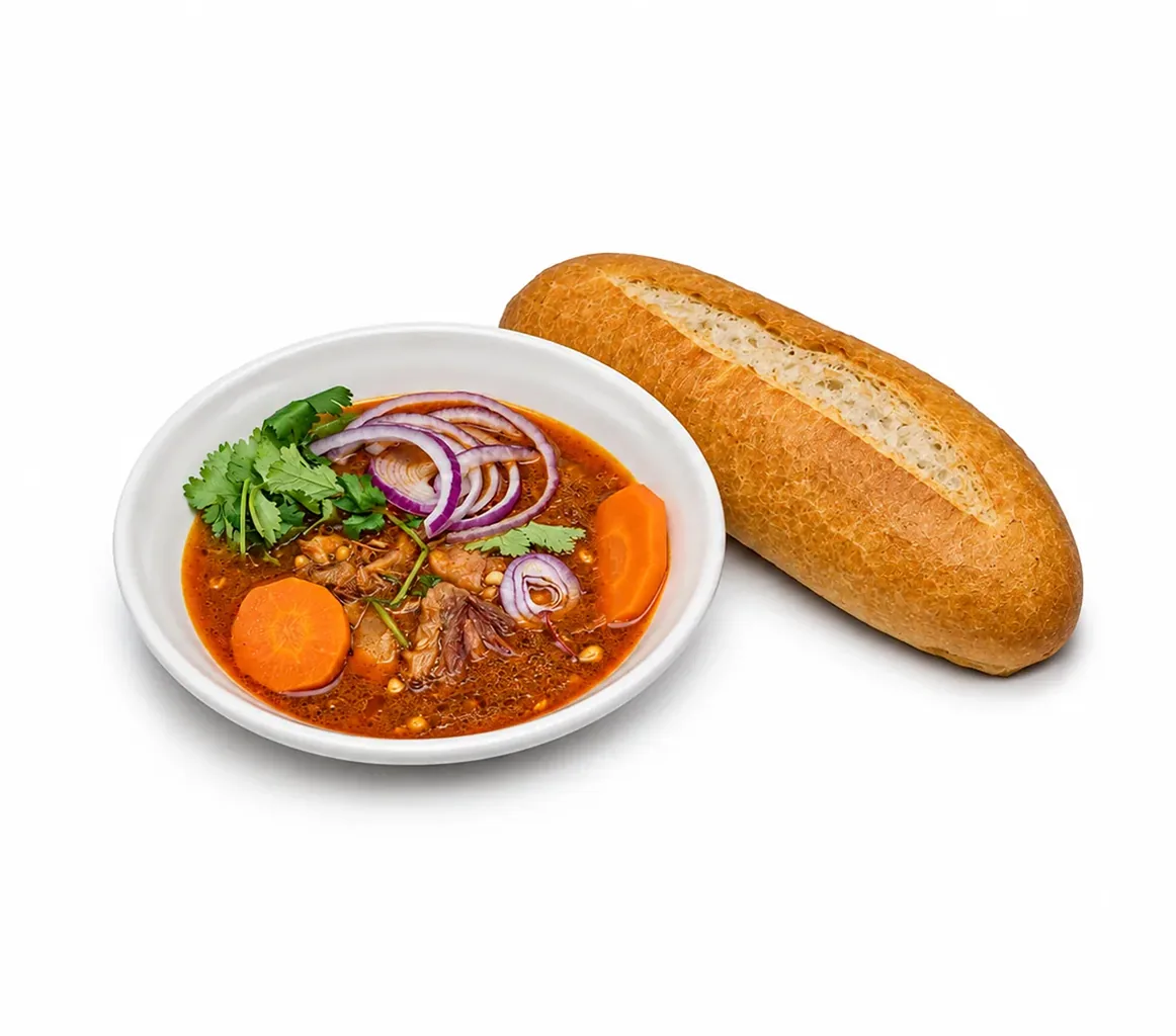
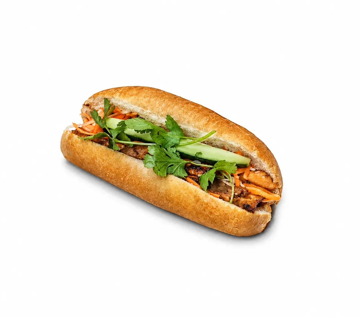
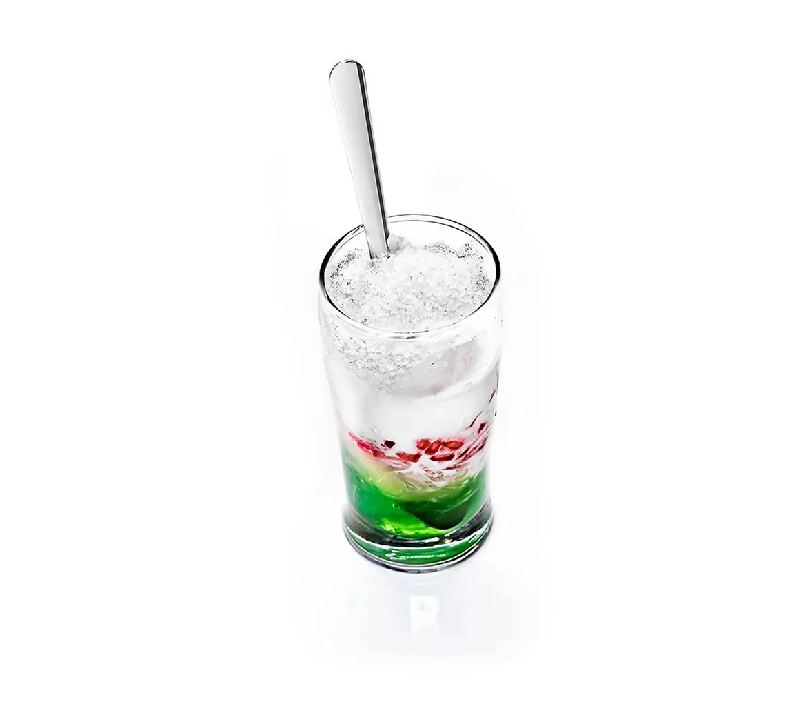
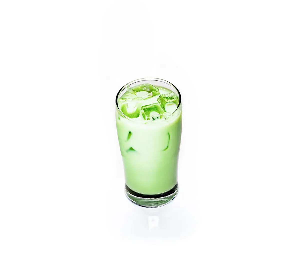
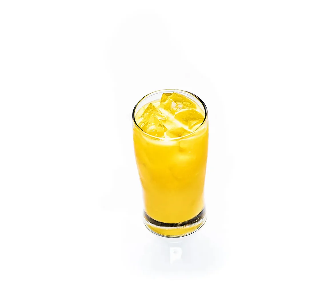
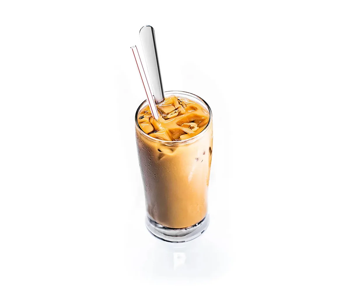
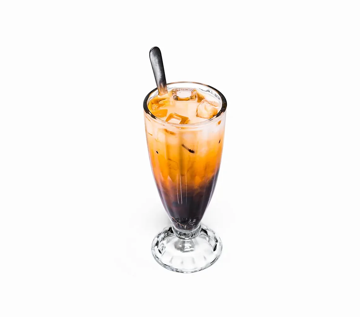
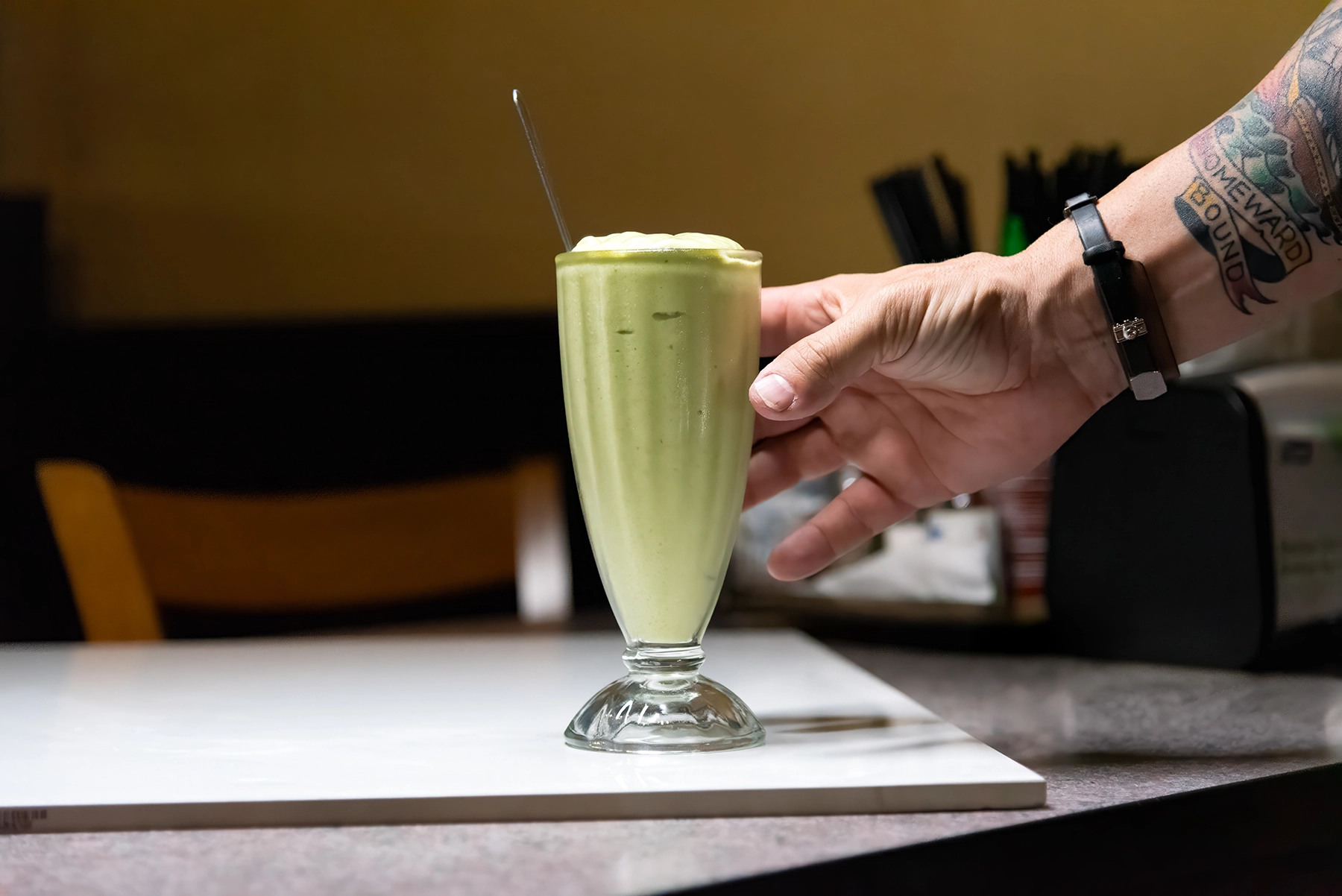
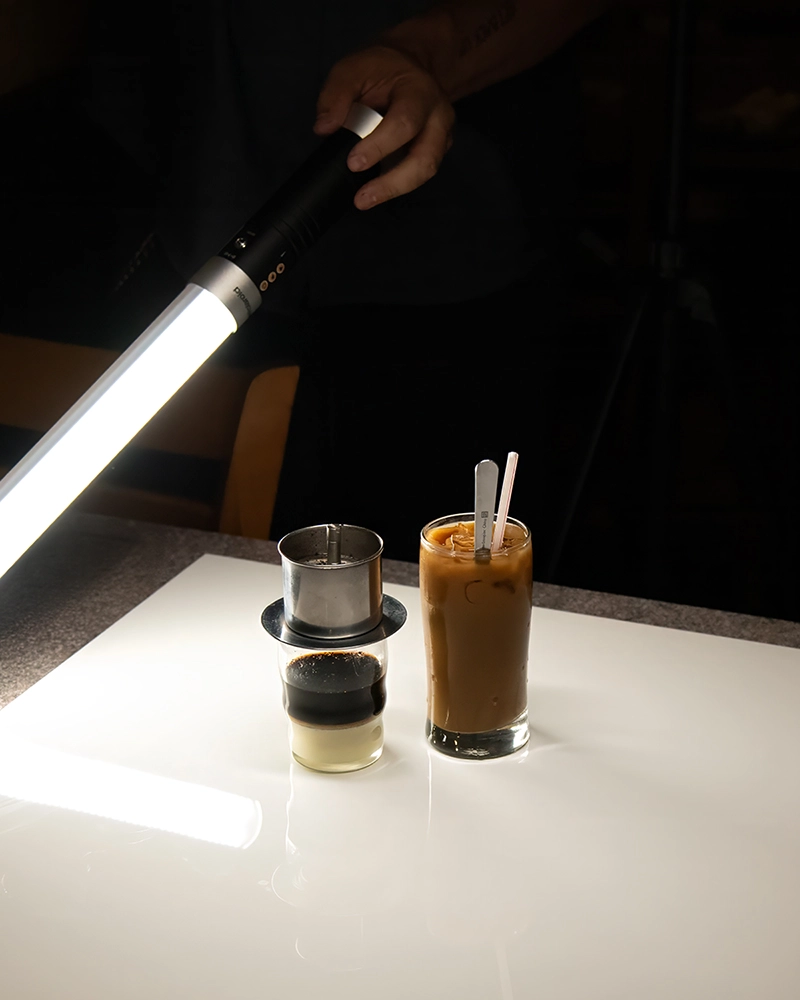
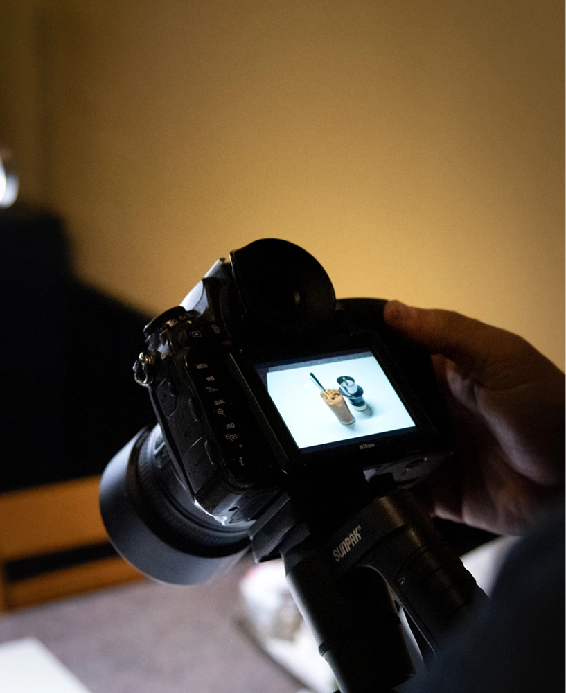
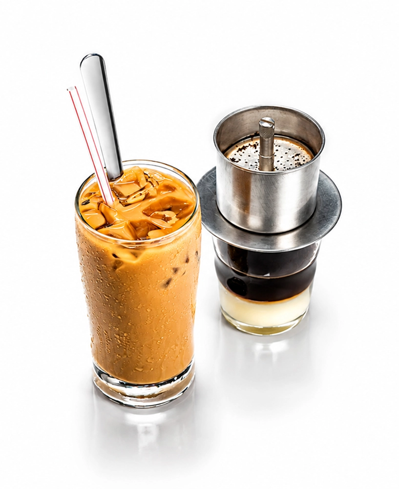
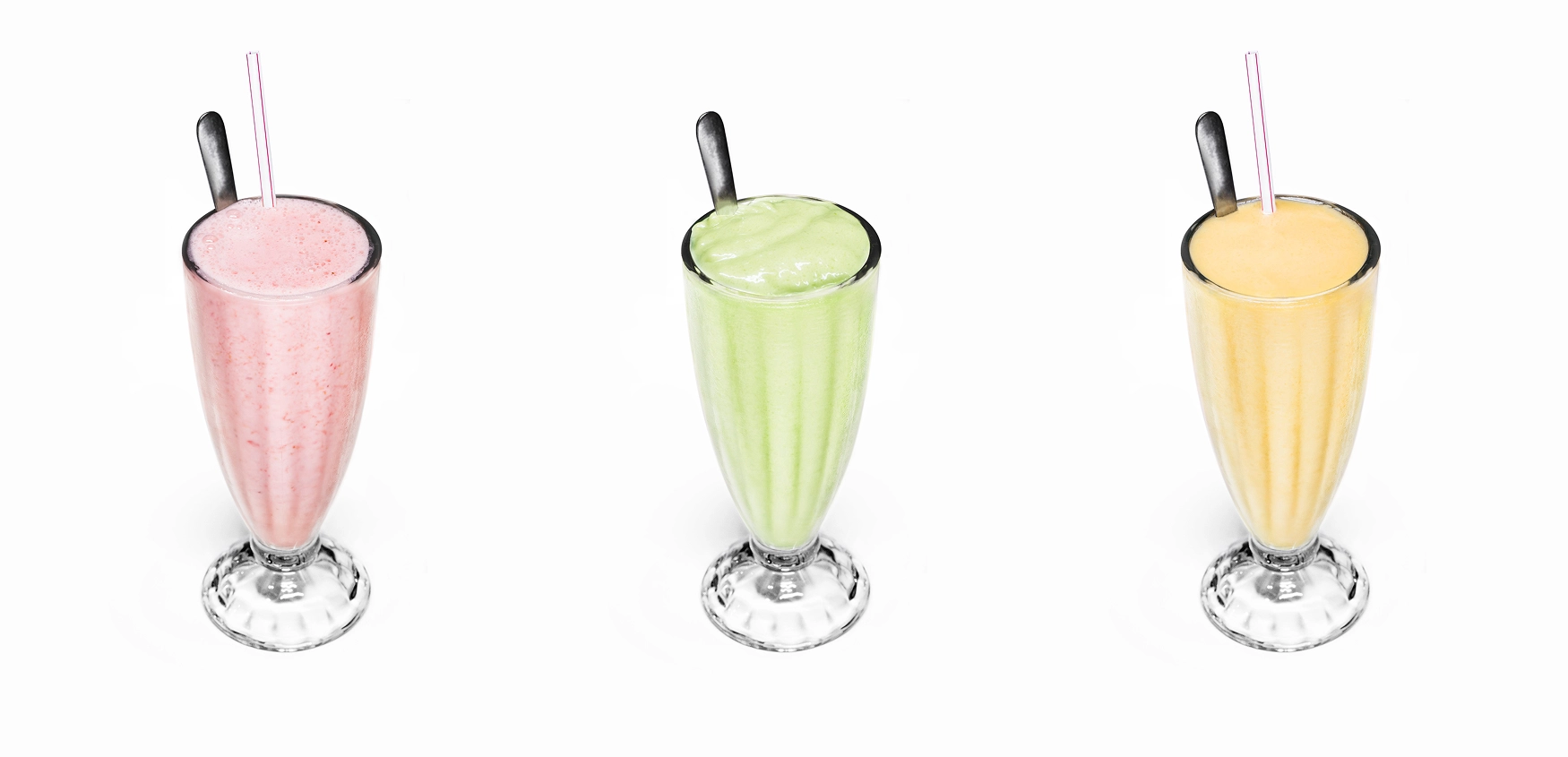
Image consistency
Every dish was shot for the menu as a product shot, isolated on white, not a lifestyle shot. Each image was then edited to match the others, so the eye stays on the food instead of readjusting to a new scene on every page. The point is recognition. A guest new to Vietnamese food can tell one dish from another and order with confidence.
Restaurant Menu Design
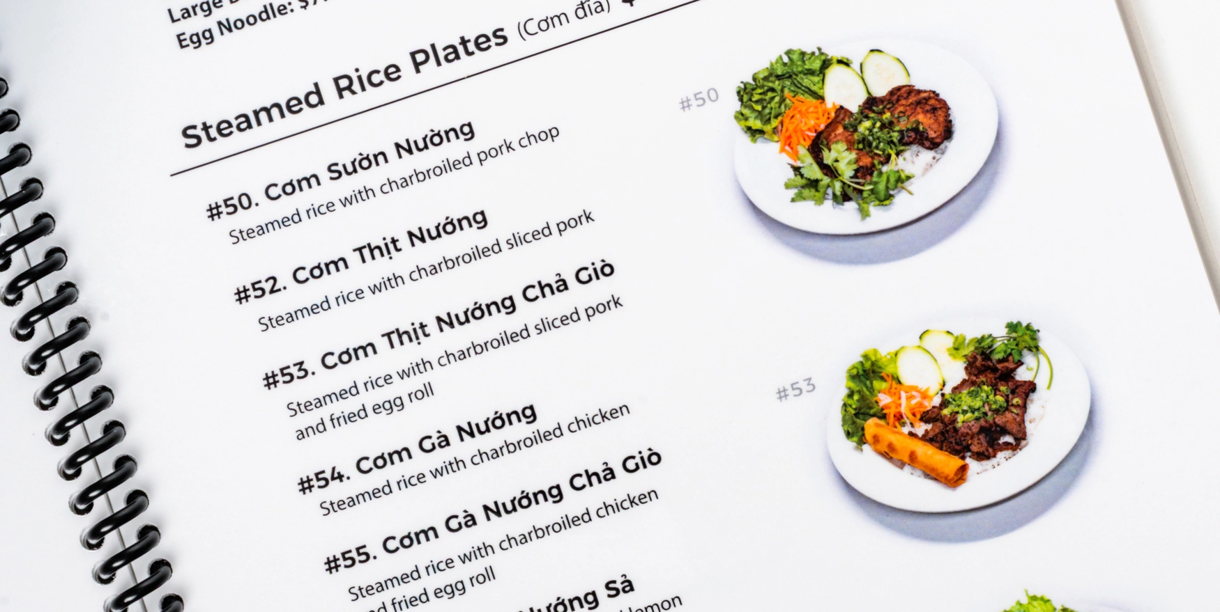
A small paper tri fold. Cramped type, just enough English to attempt an order, no photographs.
Why the menu is a book
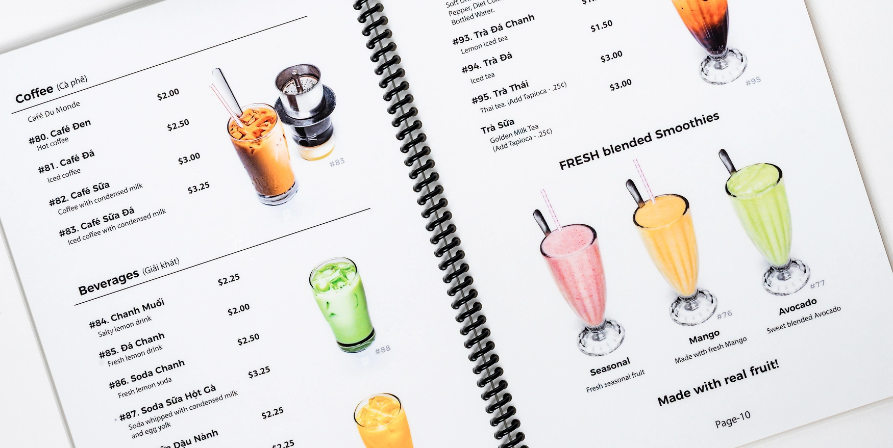
Paper menus die at lunch. Microban treated spirals wipe clean and go back out for the next service, and a bound book holds photographs at a size a guest can judge and type a guest can read in a hurry. Built to be reused, not reprinted. One decision, two audiences.
The menu is where the guest decides what to spend, and at a busy lunch they decide in a hurry. A guest who could not read the old menu ordered the safe thing, or ordered less, and at the big lunch tables servers spent the first minutes translating and explaining. Cegrix approached the menu as a UX problem. It photographed the food, then rebuilt the menus as bound books with a layout a first time guest can follow in a hurry. The guest orders with confidence and the server takes the order instead of explaining it.
Storefront Signage and Branded Apparel
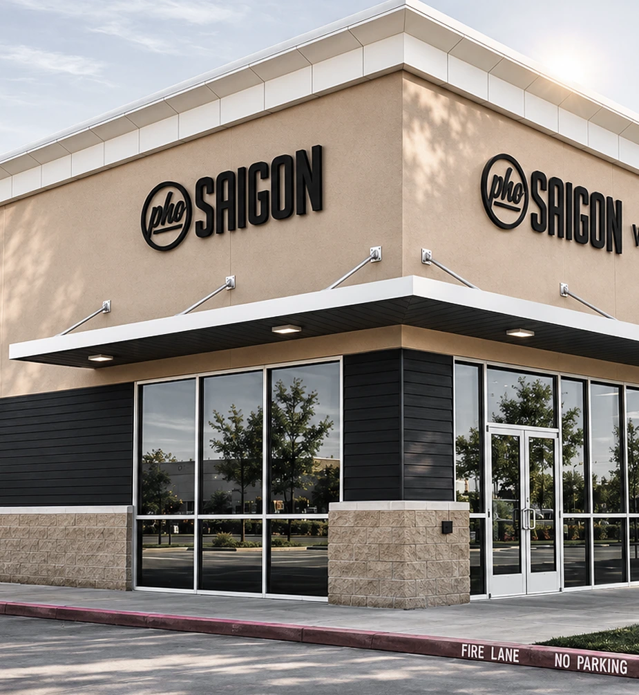
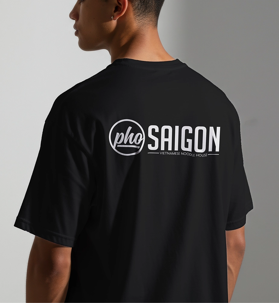
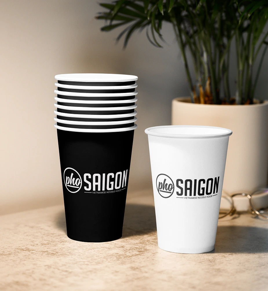
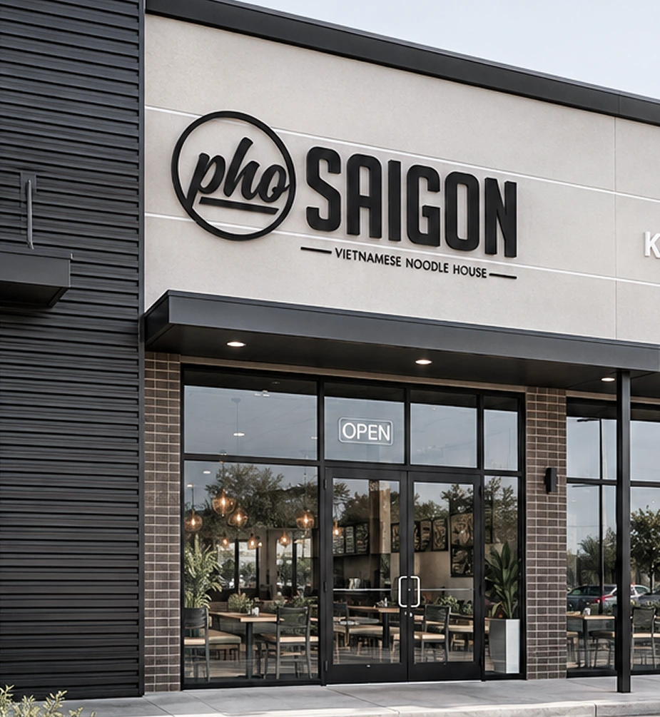
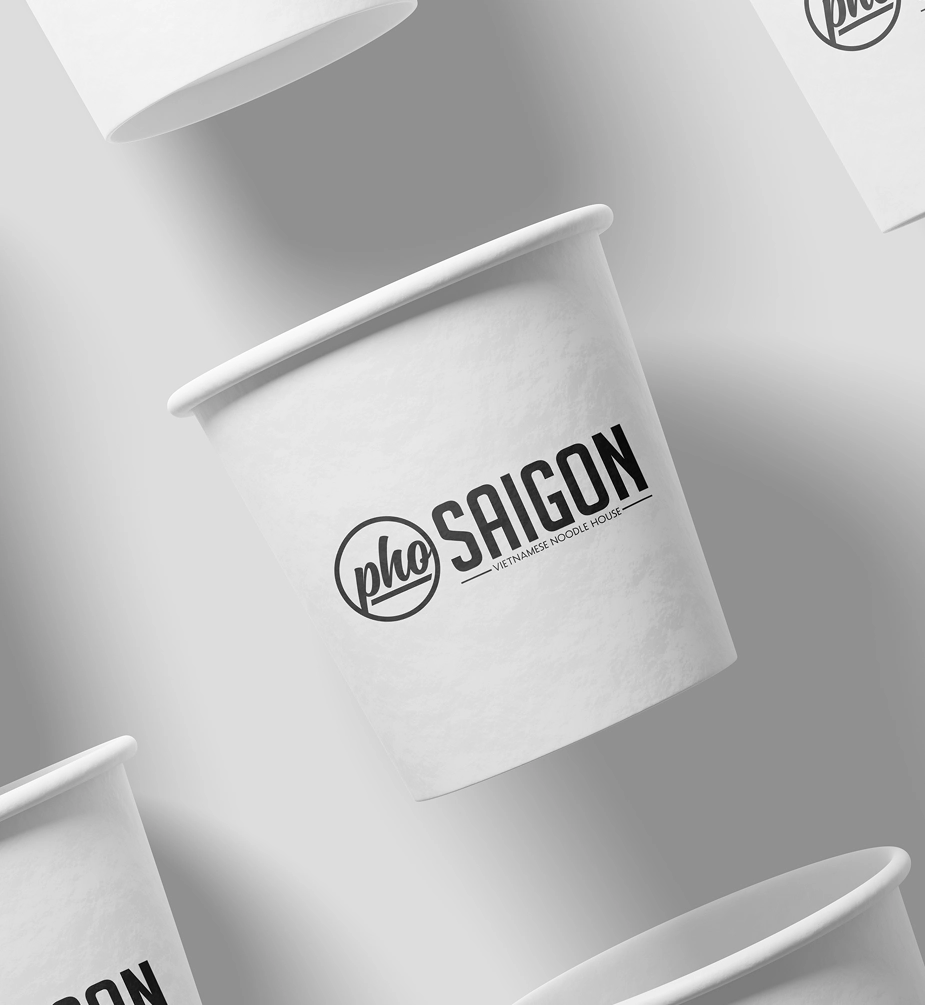
Five storefronts carry the identity, Midtown, Pearland, Tomball Parkway, Richmond and Spring Branch, channel lettering and every piece of interior and exterior signage, along with the staff's shirts and the printed material in the restaurants.
The Results
The identity Cegrix designed in 2018 is still on the menus, the shirts and five storefronts, three of them opened since, and the flagship still runs on the room Cegrix rebuilt in 2016.
"We're growing and the branding works for us and we love it."
An identity is proven when the business outgrows the room it was drawn in. Pho Saigon has gone from six locations in 2016 to nine across Greater Houston and Austin, and Tomball Parkway, Richmond and Spring Branch all opened under the 2018 identity, channel lettering to menus. The growth is theirs. The brand held.
Would this work for your business?
Let's talk about your business and where we can help. No pressure, just a free 30 minute conversation.